The challenge
The design was ready, but the website still needed a clean and scalable implementation.
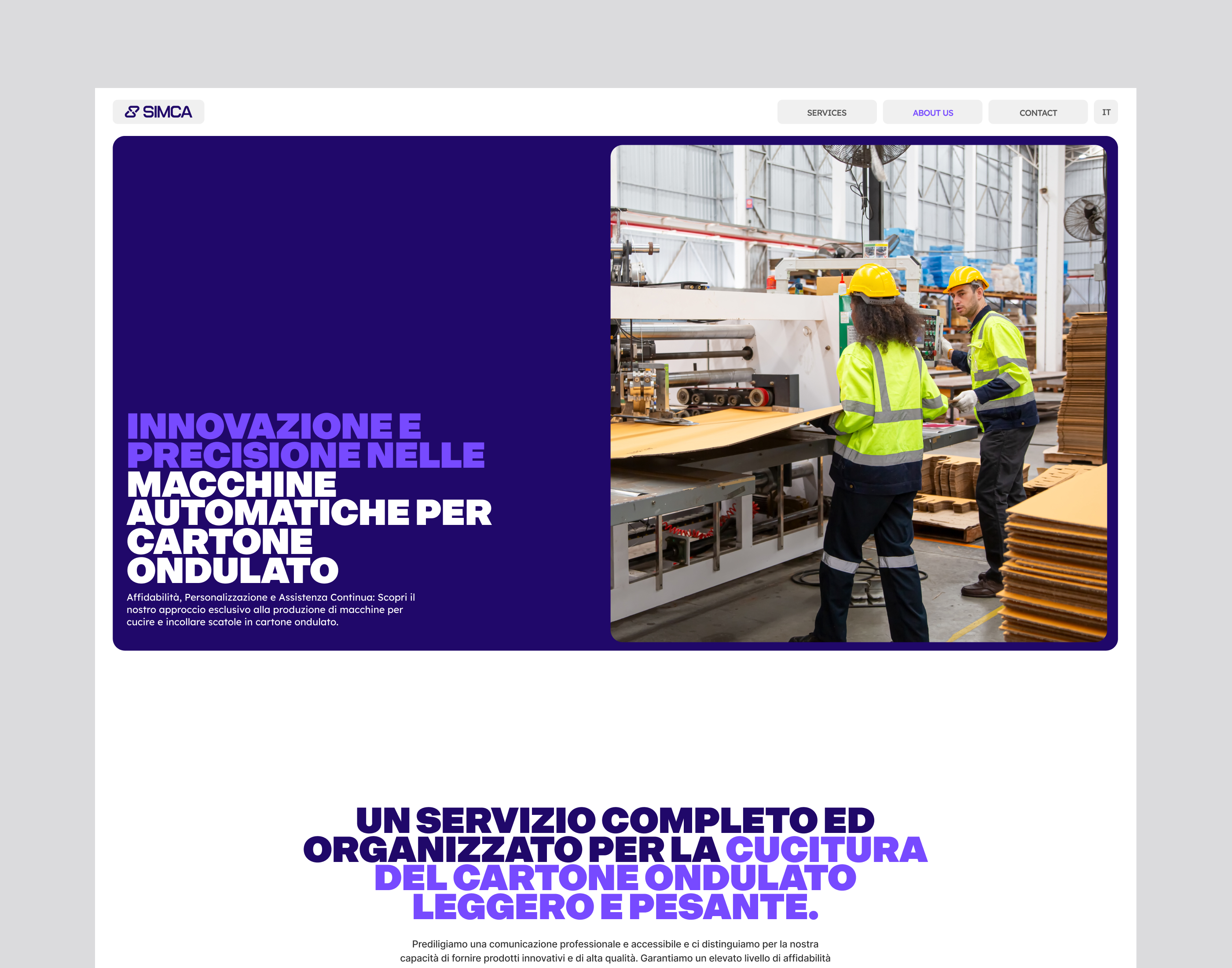
For projects like this, the main challenge is not visual design but execution. The build needs to stay faithful to the design while also ensuring the site performs well, remains easy to manage, and scales as the company grows.
What we did
We translated the finished design into a fully functional Webflow website.
The focus was on precision, performance, and maintainability so the team can manage the website easily after launch.
Scope of the work:
• Webflow development from ready design
• Responsive implementation across devices
• Clean component structure
• Performance optimization
• CMS setup where needed
• Launch support
Result
The final website matches the original design while providing a stable and scalable Webflow implementation.
The team now has a website that loads quickly, works reliably across devices, and can be easily updated as the business evolves.