Pipestream
Turning a product-led CRM into a website that drives demo intent
Pipestream is a CRM platform built for modern B2B teams managing outbound, inbound, and pipeline operations.
The product experience was strong.
The website didn’t reflect that strength.
Traffic was coming in, but the messaging wasn’t converting at the level it should. The page explained functionality, but it didn’t build urgency or confidence fast enough.
This wasn’t about aesthetics. It was about structure.
The Challenge
The homepage tried to do too much.
Features were introduced before positioning was clear. Proof was scattered. The page felt informative, but not persuasive. Pricing lacked a clear hierarchy, and the demo CTA competed with secondary actions.
For a CRM competing in a crowded SaaS category, that friction costs pipeline.
What We Changed
We rebuilt the homepage around a guided evaluation journey.
Instead of stacking sections, we designed a decision path:
• Clear positioning.
• Immediate credibility.
• Outcome-driven capabilities.
• Integration confidence.
• Structured pricing.
• Focused demo action.
Every element was tied to one goal: increase demo intent.
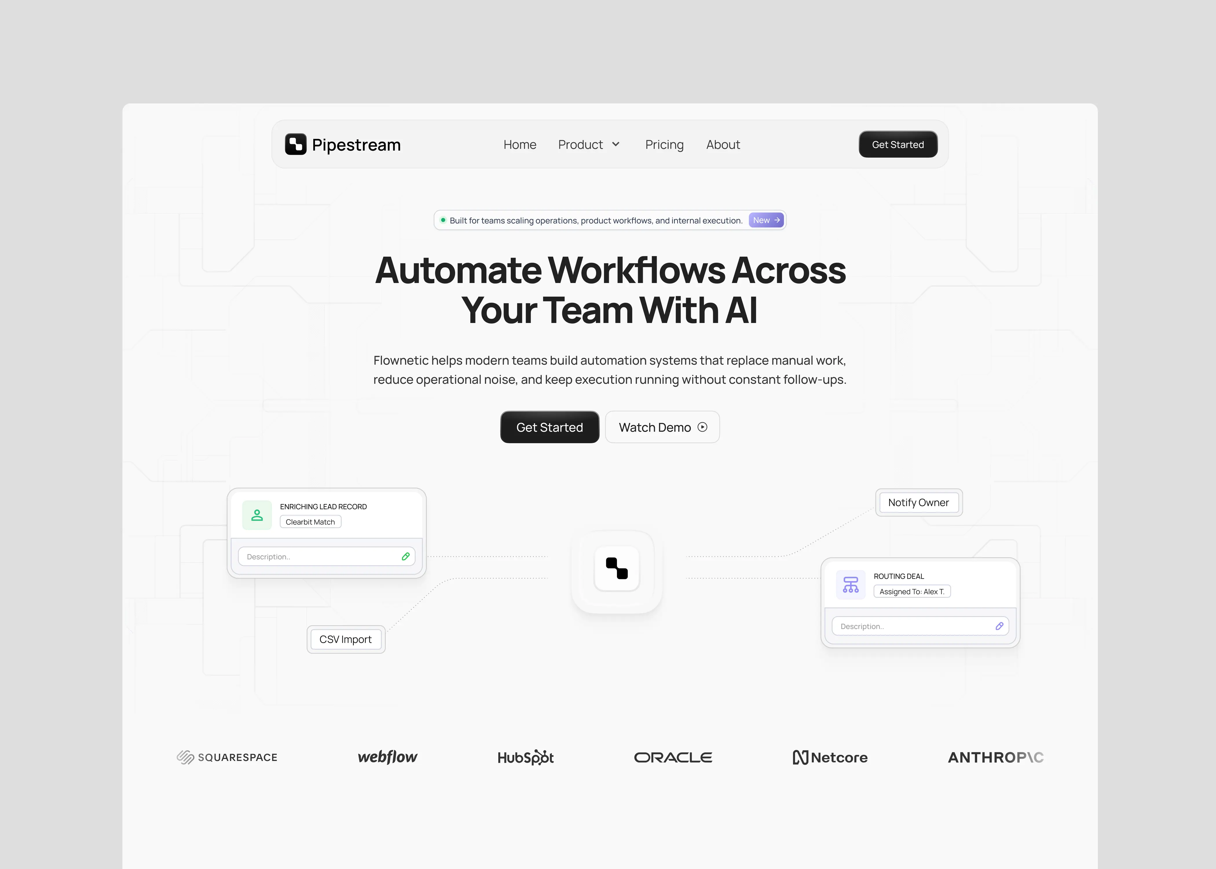
Clarifying the First 5 Seconds
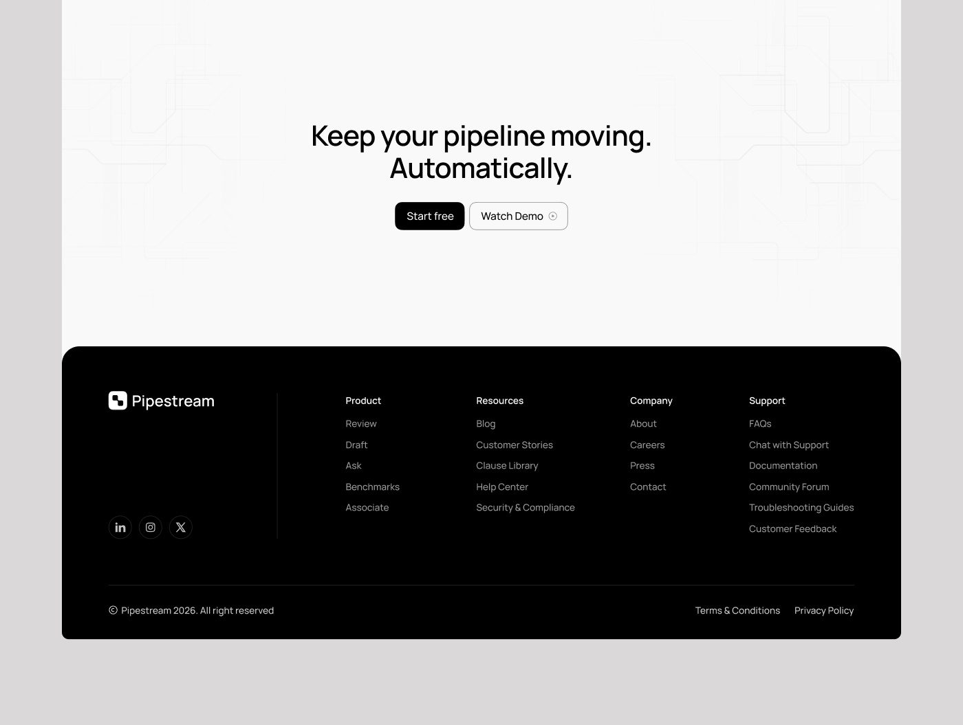
The hero was simplified to communicate one clear outcome: control and visibility across the sales pipeline.
Instead of feature-heavy messaging, we focused on what the buyer gains. Product UI was positioned as proof, not decoration. CTA hierarchy was tightened so the primary action was unmistakable.
The goal was immediate comprehension.
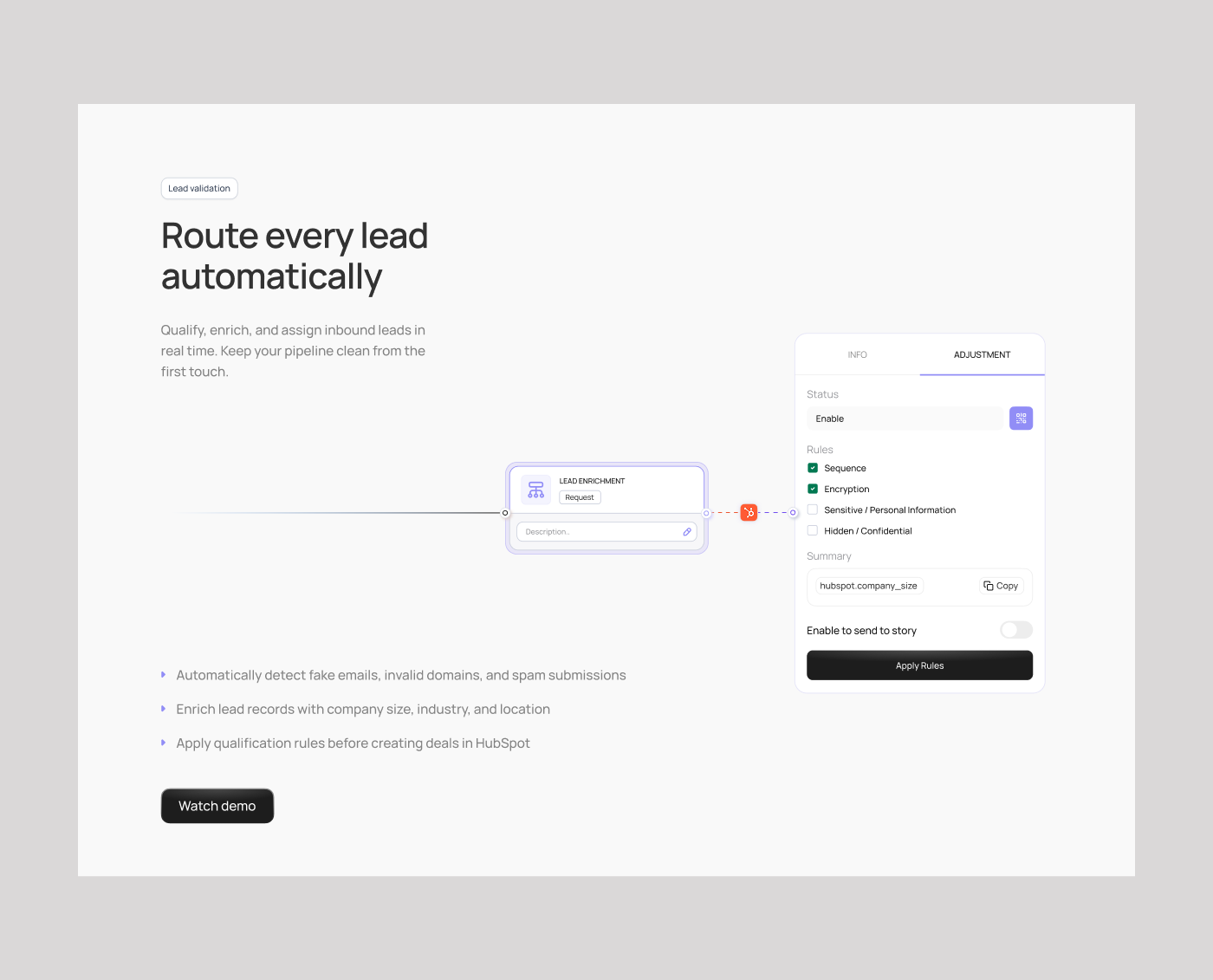
Reframing
Rather than listing tools and modules, we organized the product around operational impact.
• Pipeline visibility.
• Workflow automation.
• Forecast accuracy.
• Team accountability.
This shift changes perception. The product stops feeling like “another CRM” and starts feeling like a revenue system.
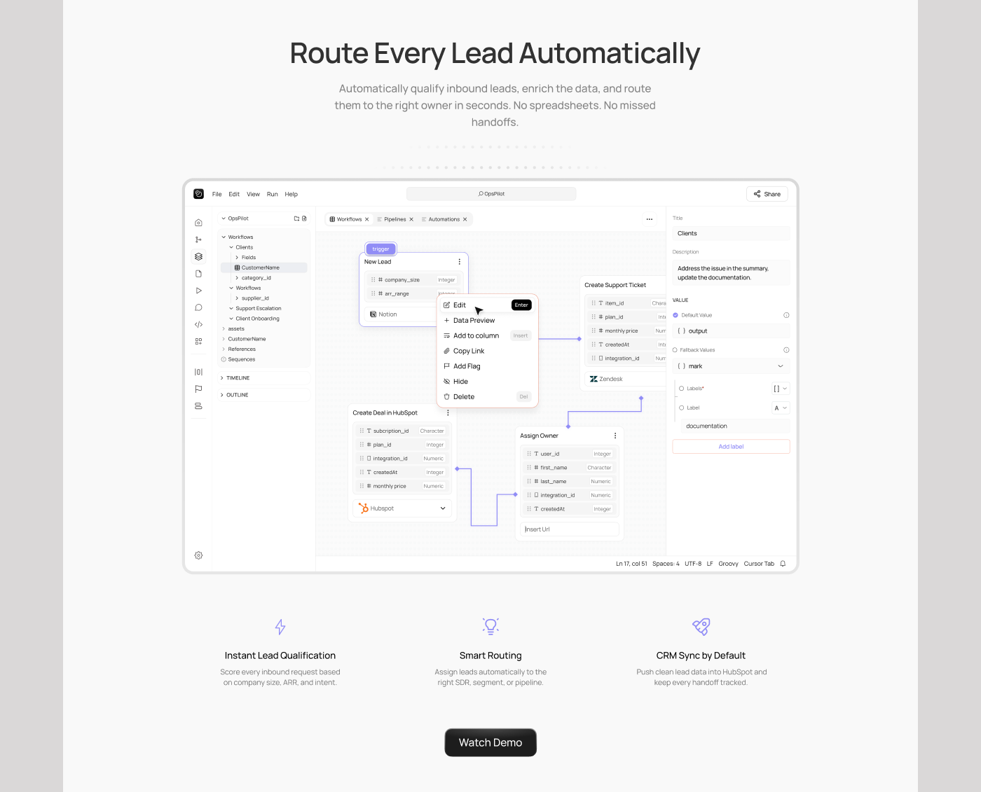
Trust as Structure
Integrations, UI proof, and capability clarity were brought earlier in the scroll.
SaaS buyers want reassurance before commitment. By stacking trust signals progressively, we reduced hesitation before the pricing and demo sections.
The page began to feel credible before asking for action.
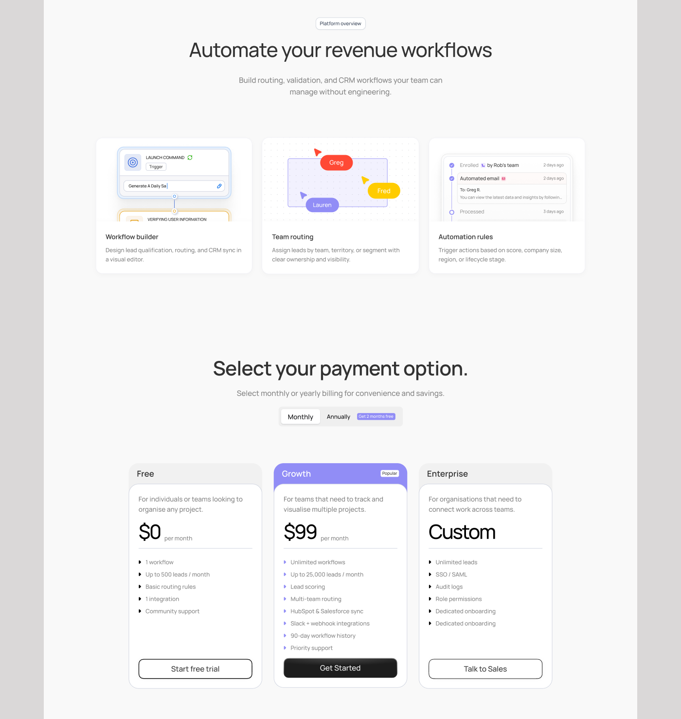
Designed to Convert
The pricing structure was rebuilt as a logical growth ladder.
Starter for smaller teams.
Growth as the natural default.
Enterprise for scale.
The middle plan was positioned as the smartest decision for most teams. Clear feature alignment and visual emphasis reduced comparison friction and increased upgrade intent.
Measurement From Day One
The new structure supports measurable behavior.
CTA hierarchy allows tracking of primary vs secondary intent. Pricing engagement can be analyzed. Section depth supports future A/B testing.
This wasn’t just a redesign. It was a foundation for continuous optimization.
The Result
Pipestream’s website now:
Communicates positioning in seconds.
Builds credibility before asking for a demo.
Frames features around business outcomes.
Guides buyers through pricing logically.
Supports ongoing conversion optimization.
The product didn’t change.
The way it was presented did.
And that changes decisions.