Home
Work
About Us
Contact
Let's Talk
Let's Talk
Home
Work
About Us
Contact
Apply for Audit
Apply for Audit
Contact
info@wavescreative.co
+48 501 199 364
Social Media
Instagram
LinkedIn
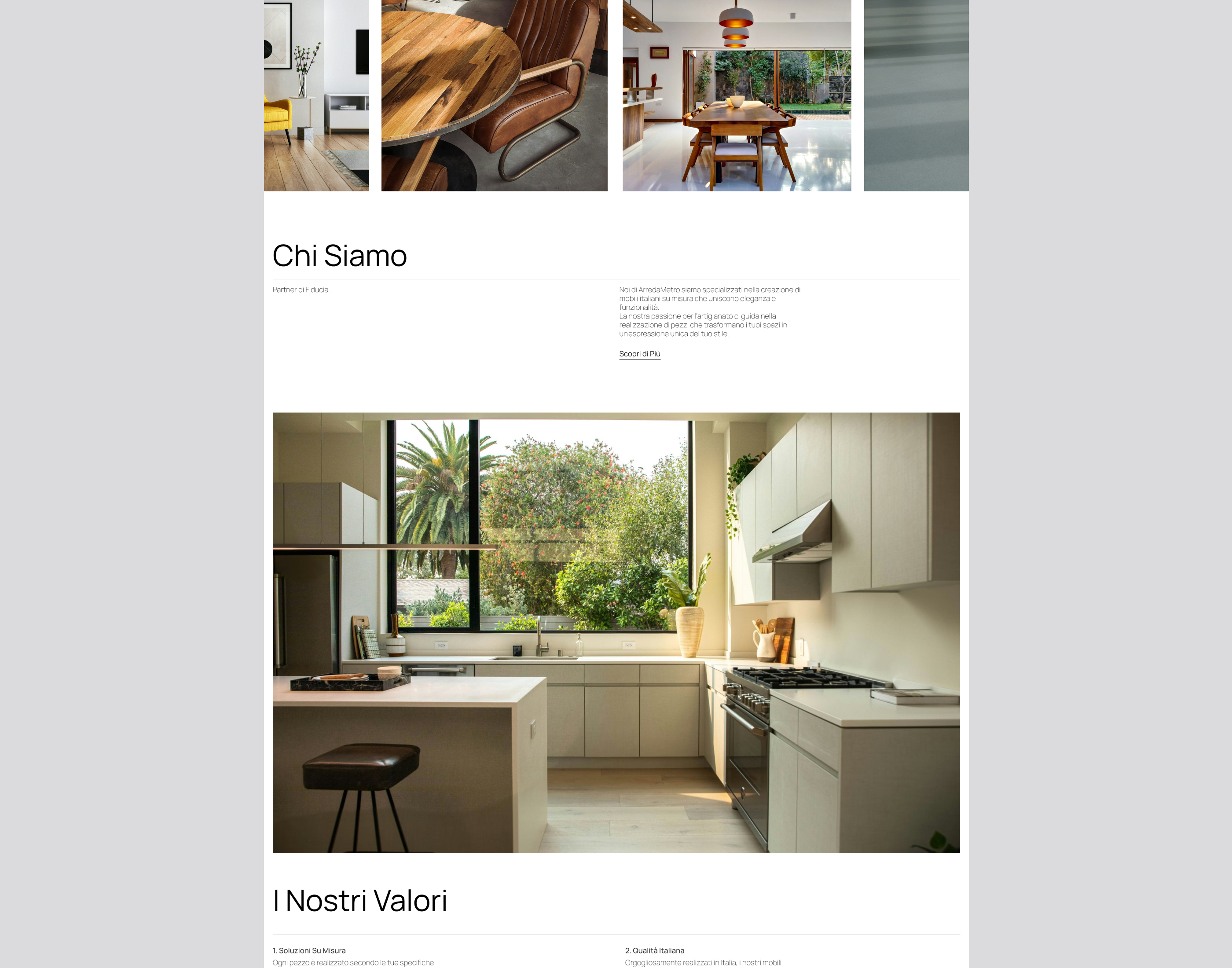
Arredametro
Visit live website
Visit live website
Contents
Heading 2