Arcline CRM
Repositioning a CRM website around pipeline conversion
Arcline is a B2B CRM platform built for sales teams that need clean deal visibility, automation, and better forecasting.
The product was strong. The website wasn’t converting. This Pipeline Study shows how we rebuilt the homepage structure to support SaaS buying behavior and increase demo intent.
The Challenge
The homepage didn’t reflect how SaaS buyers actually evaluate software.
The value proposition wasn’t clear in the first few seconds. Trust signals appeared too late. Capabilities were presented as features instead of business outcomes. Pricing lacked a clear decision path.
For a CRM platform competing in a crowded market, that’s expensive.
Rethinking the Structure
Instead of redesigning sections, we rebuilt the evaluation flow. The new structure was designed around how B2B decision-makers think:
Clarity first.
Proof second.
Capabilities in context.
Pricing with intent.
Clear demo action.
Every section earned the next one. Nothing was decorative.
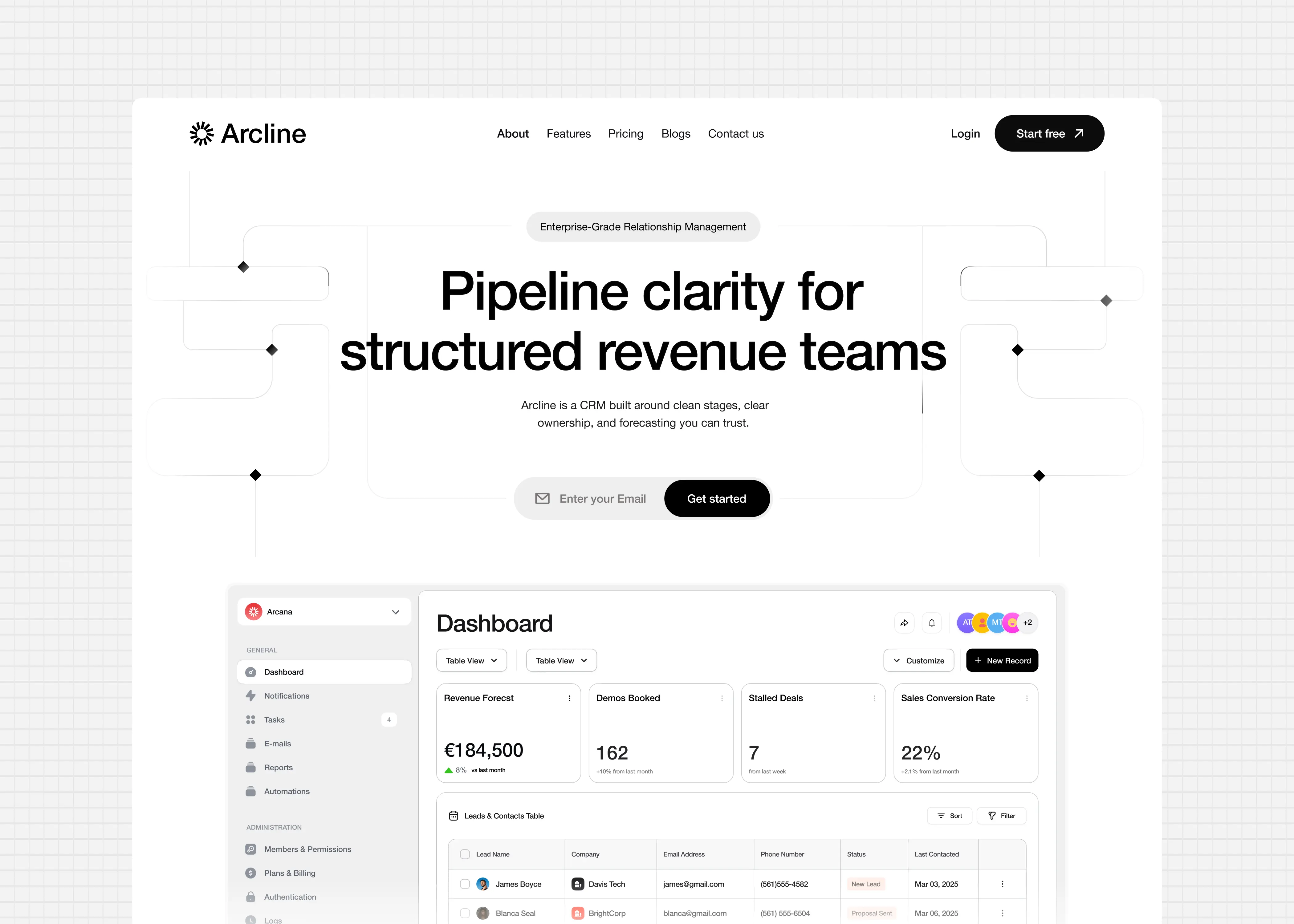
Positioning
The hero was rewritten to focus on pipeline control and revenue visibility, not feature lists. The goal was simple: within five seconds, a sales leader should understand what Arcline improves. Product visuals were treated as evidence, not background decoration. CTA hierarchy was simplified to reduce friction and push demo intent.
Key Decisions
1. Clear Hero Positioning
We tightened the hero message to focus on the outcome: pipeline visibility and control.
The goal was simple:
Make the buyer understand what Arcline does in 5 seconds.
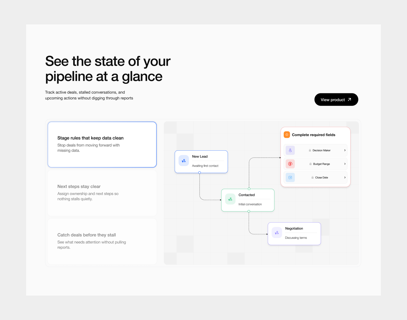
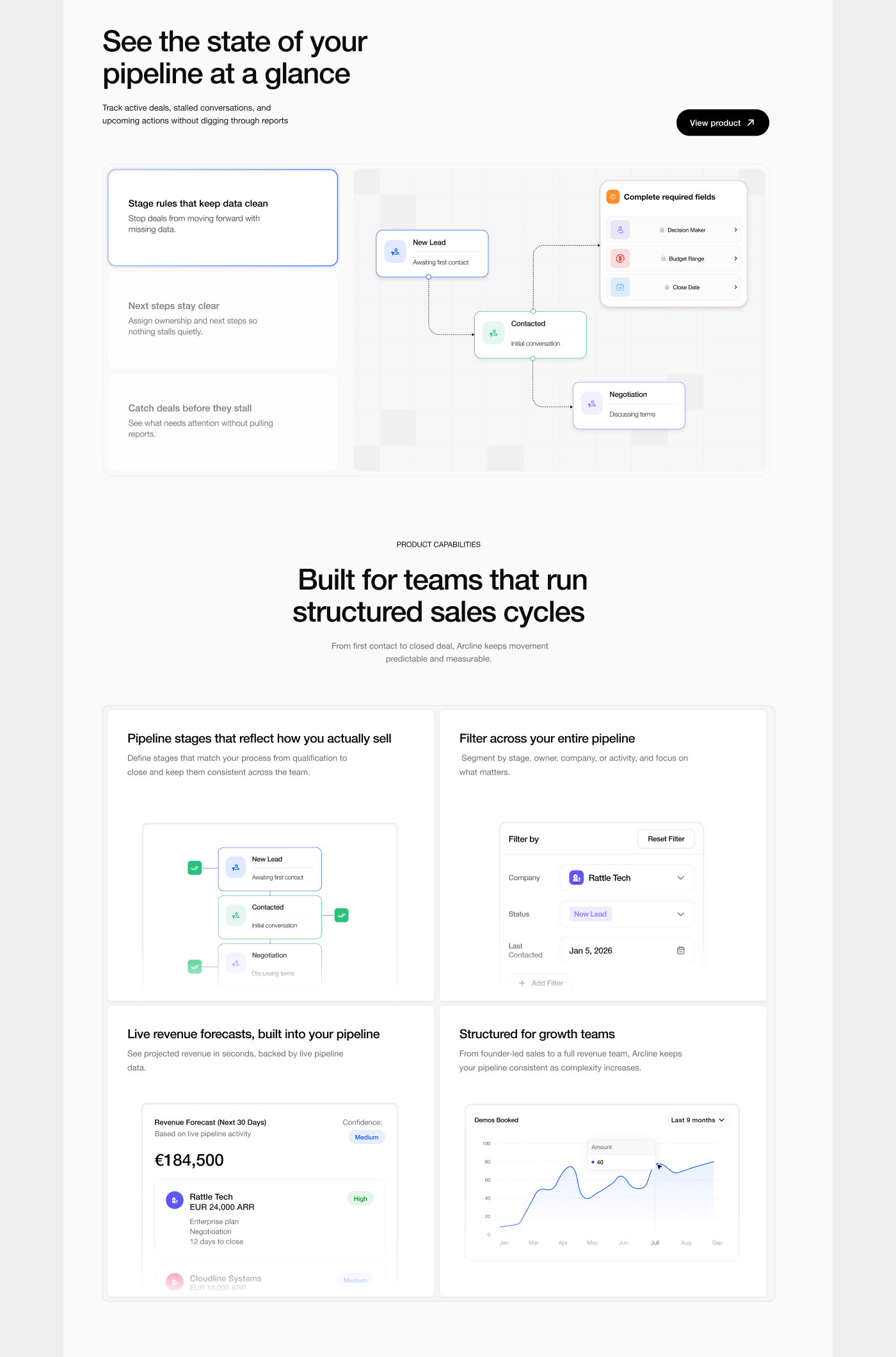
2. Capabilities Grouped by Outcome
Instead of listing features, we grouped product capabilities around what matters to sales teams:
- Pipeline visibility
- Forecast accuracy
- Workflow automation
- Team performance tracking
This makes the product easier to evaluate and easier to trust.
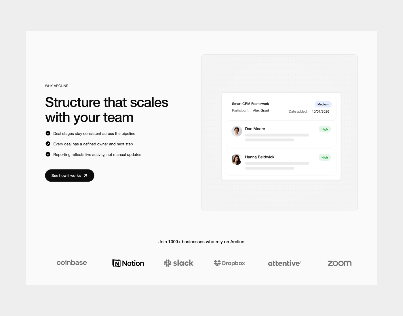
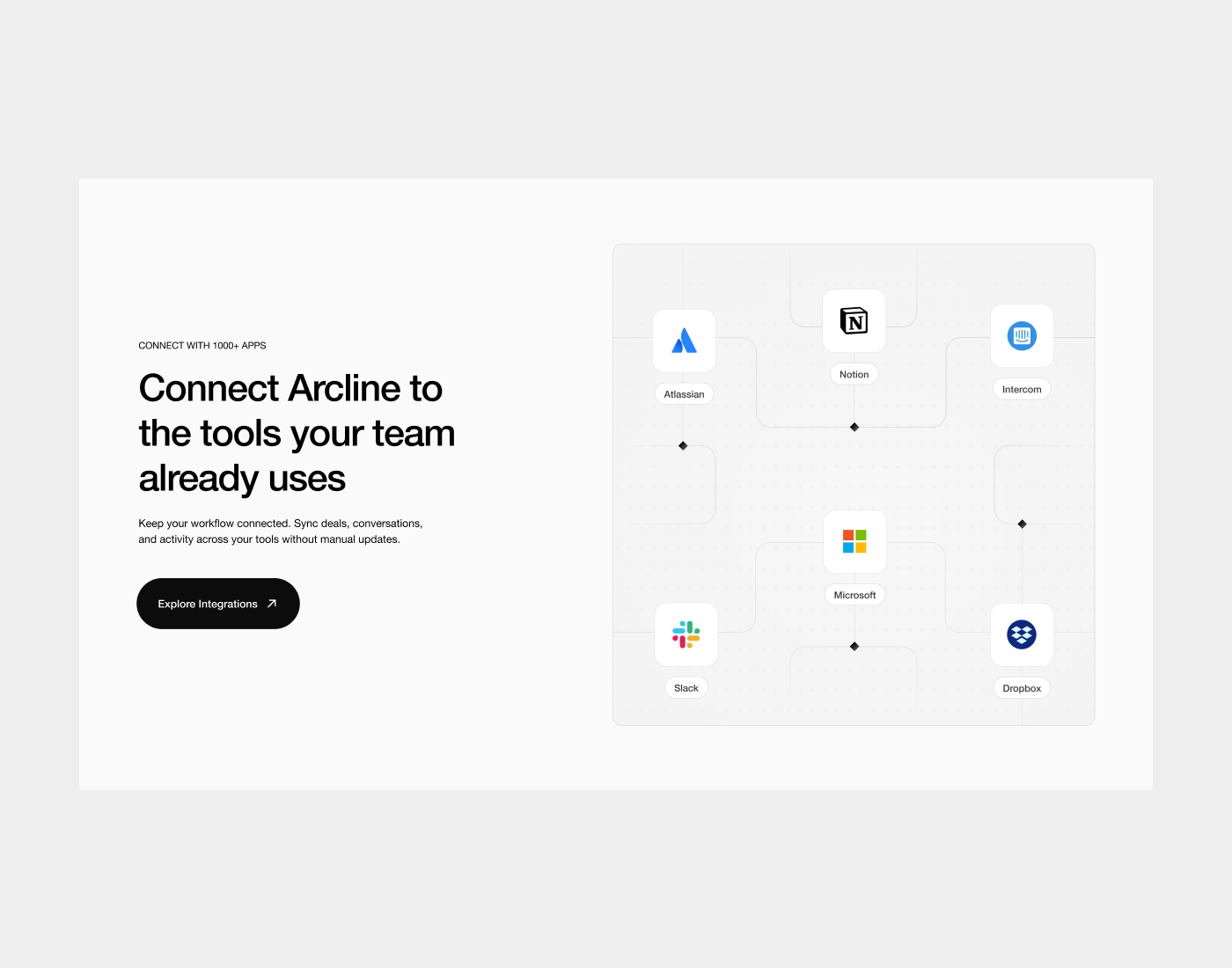
3. Trust Stacked Early
We placed credibility signals earlier in the page:
- integration context
- product UI proof
- structured feature explanation
Instead of “trust us” messaging, we used visual evidence.
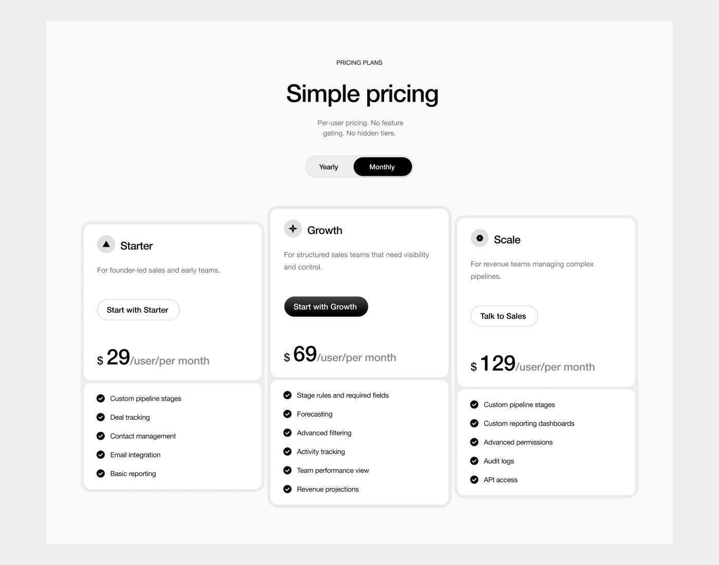
4. Pricing Built to Convert
We structured pricing as a growth path:
Starter → Growth → Enterprise
The middle plan was designed as the default decision, with the clearest value-to-price ratio.
This reduces decision friction and increases upgrade logic.
5. Measurement Built In
We designed the page to be trackable from day one.
That includes:
- clean CTA hierarchy (primary vs secondary actions)
- conversion event structure (demo clicks, pricing engagement, form intent)
- page sections aligned to funnel steps
- a foundation for A/B testing and iteration
The goal wasn’t “better design”.
It was a website you can improve based on real behavior.
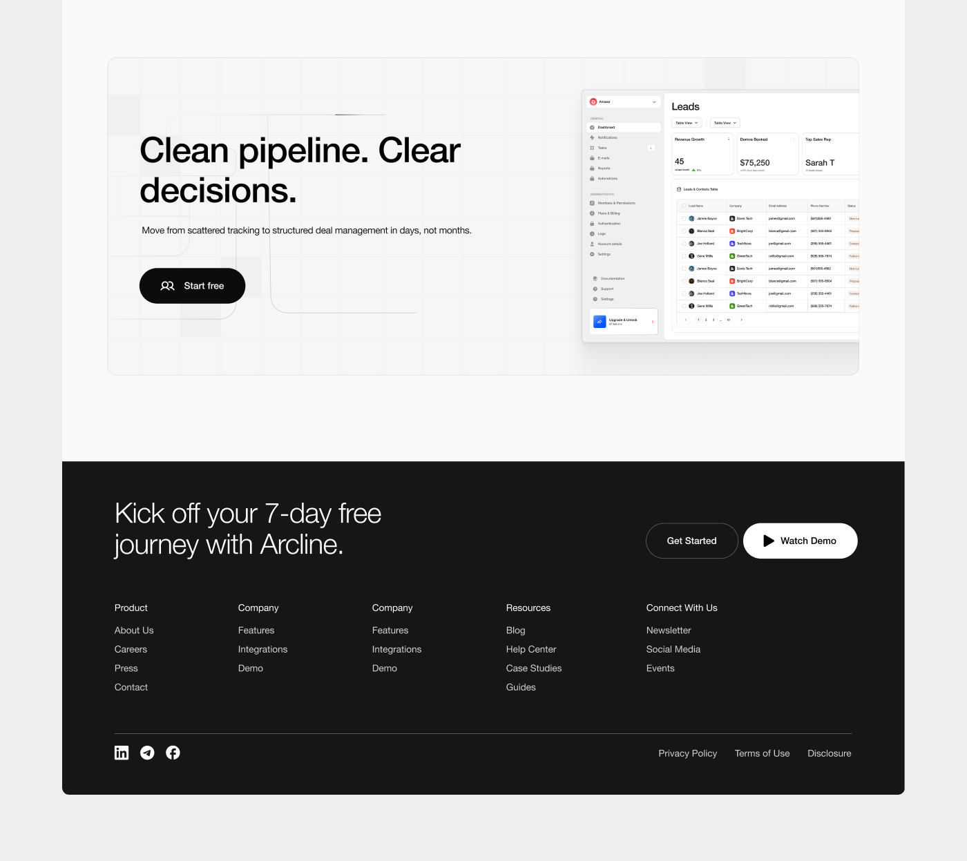
Outcome
The result is a homepage that:
- explains the product instantly
- builds credibility early
- makes capabilities feel relevant
- guides visitors toward pricing and demos
- feels enterprise-ready without sounding corporate
This is the difference between a website that looks good and a website that sells.